Temperature Blanket
30 Jul 2023Background
A temperature blanket is a sort of physical infographic. It’s a year-long knitting or crochet project. You do a piece of the blanket every day, with the colour based on that day’s temperature (weather).
Within that basic concept, there’s a lot of room for variation — squares or stripes, different stitch patterns etc.
In my case, I chose crochet squares.
Research
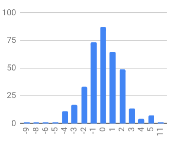
To get a sense of the distribution of temperatures — and by extension colours — I wanted to look at temperatures over the course of the previous year (2022). This was surprisingly hard to find. But eventually I came across Visual Crossing.
I loaded the data into Google Sheets to explore
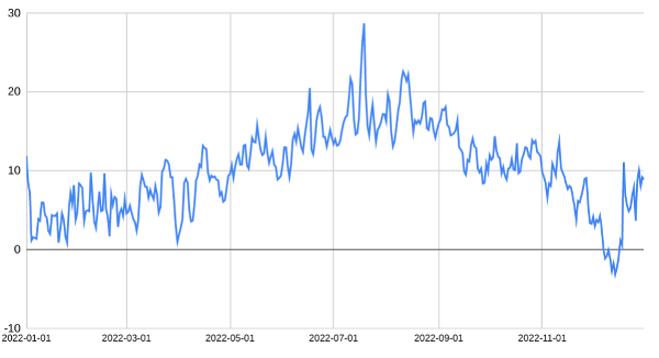
These are daily average temperatures.
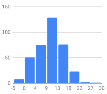
As we can see, the temperatures are roughly normally distributed, average around 10C, skewing towards lower temperatures.
Colours
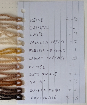
I decided to split the range into 2 degree steps between 0 and 30 C, plus <0 and >30 as singular groups.
Like any knitter/crocheter, I have way too much yarn (my ‘stash’ in the parlance). So I looked at this as an opportunity to use up some of that yarn. I started by laying out the balls I had the most of, arranging them in a rough spectrum: blue→green→yellow→red
I started out with a fairly even split of each colour, but decided to skew them towards blue — I wanted to use blues for the temperatures which ‘feel’ cold (<12C), green for ‘comfortable’, yellow for warm, and red for hot.
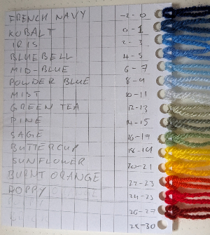
I ended up making a couple of adjustments as I was going. I added an extra blue when the temperature dipped below -2C. I also dropped one of the yellows because, when we had a heatwave, it didn’t reach the 3rd yellow despite feeling very warm; I wanted to get to the oranges/reds sooner.
Design
I decided to do squares, that felt like it would be less tedious than long rows of repeated stitches. It also allows for doing squares on their own, which became important when I ran out of the white joining yarn.
The squares are done in lichen stitch, as described here.
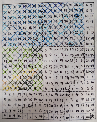
I was originally planning on doing 14x26 (364 total), but that comes out relatively long and thin.
Then I saw someone else’s pattern doing 18x21. That comes out at 378 squares, or 365 (one per day) + 12 (one per month) + 1 (one for the year).
For the month markers I’m representing the month number in binary: excluding the centre and border there are 4 rounds in a square, so can represent 0-15 (or 1-12 in this case). The color is taken as the average temperature for the whole month.
I haven’t decided what to do for the final, year marker yet…
The layout of the squares follows a Z-order (Morton) Curve - a space filling curve which ‘preserves locality of data points’. In other words, consecutive days are always placed (relatively) close together; more so than the typical left-to-right top-to-bottom layout.
Below is a diagram of the layout, which I also use for tracking progress.
Bonus: Temperature Scarf
While I was exploring the data for the previous year, I also looked at the temperate change from day to day.
The interesting thing here is, while the temperature increases and decreases slowly over the course of the year creating a smooth(ish) gradient, the size of the temperature changes vary a lot more from day to day.
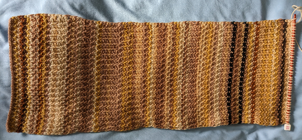
For this, I decided to do a scarf, since another blanket would be too big of a time commitment.
Specifically, I decided to use tunisian crochet, with one row per day. The pattern is 42 stitches, alternating tunisian simple (TSS) and tunisian purl (TPS).
For positive (increasing) changes I start the row with TSS, and for negative (decreasing) change I start with TPS. The effect is that when there are consecutive days of all increasing (or all decreasing) changes, there is a clear line along the fabric.
For the colours, I chose shades of brown, since I have a lot of them. Once again, I laid them out and arranged them in a way that looked good. But you’ll notice the colours don’t strictly gradient from light to dark
Progress
This is what the blanket looks like up to the start of July
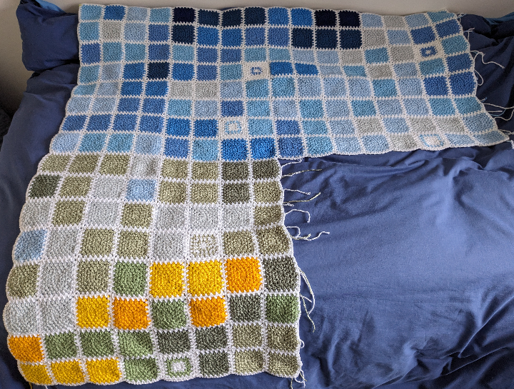
The look of it calls to mind the GitHub activity ‘heat map’ (appropriately enough).
We’re at the end of July at the time of writing, and we haven’t made it into the oranges/reds. On the one hand, it would be nice to see those colours incorporated. But on the other hand, I really don’t want it to get that hot 😬
I’m a lot more behind on the scarf, but it looks like this up to early April
Anyway. Quite time consuming, but not a bad way to pass the time while watching TV.
If you have a ravelry account, you can follow my progress here.
UPDATE: the completed blanket
Chris.
[spot the heatwave]