Watch Face Designs for Android Wear (and How to Make Them)
12 Mar 2015 In a previous pair of blogs, I designed some clock widgets for Android, using Zooper. At the end, I said that if I ever got a smart watch I'd remake them for Android Wear.Well, here I am following up on that promise. I've also thrown in a few new designs for good measure.
Now, these are mostly concept watch faces - which is to say, they're more 'look at this cool thing you can do', than the sort of watch faces that you'd actually want to use.
As with the previous blogs, I've provided download links for my designs (which you should be able to customise), along with general instructions for how they're constructed, as well as some code snippets.
I know that a lot of the people who read this post will have come here from trying to google how to do something. As someone who does the same, I want this to be as helpful as possible.
Note, these faces were designed in particular for my watch - Moto 360. So if you have a different device (in particular, a square faced device) you might want/need to tweak some stuff.
Watchmaking Apps
There are two popular apps for making Android Wear watch faces - Facer and WatchMaker. I've tried (and paid for) both.
Facer is very bare-bones - the only objects available are text, shapes and images, and the only customisation options are object size, position, rotation, colour, and opacity. I think it's aimed more at people who want to import images to construct their faces.
WatchMaker has many more build-in objects, including dials, hands, weather, battery, countdowns, series, etc. There are also more customisation option to play with (and more still if you pay for Premium).
Facer uses the same syntax and tags as Zooper, so if you're familiar with that you might prefer Facer. But that also means it has the same shortcoming, in particular with respect to if-statements.
Watchmaker, on the other hand, uses the programming language 'Lua' for its coding. I'm not familiar with Lua as a whole, but I found it easy to pick up here, and easier to work with than the Zooper-style syntax.
Of the two apps, I personally prefer WatchMaker - I like all the extra built-in objects and customisations, and I find the Lua syntax, and the way WM handles layout (see below) easier to work with.
This means, then, that most (but not all) of the download links and code snippets in this blog are going to be for WatchMaker. You should be able to recreate a lot of the designs in Facer though.
Design Layout
Facer and WatchMaker use different coordinate origins - Facer positions objects relative to the top-left corner of the screen, where WatchMaker positions objects relative to the centre of the screen.
 |
| Notice that the y-axis is upside down in both apps. |
Now, for watch design, we'll often need to convert the positions of objects from polar coordinates - distance from the centre of the screen (r), and rotation about the centre (\(\theta\)) - to Cartesian coordinates (x, y).
Traditionally, the conversion is
\[ x = r \cos(\theta) \\
y = r \sin(\theta) \]
But this positions objects relative to the positive x-axis, or 3 o'clock (blue). Really, we want to position objects relative to the negative y-axis, or 12 o'clock (yellow).
To correct this, we have to subtract 90 degrees from the angle, \(\theta\). Or, alternatively, we can use some trigonometric identities to rewrite the conversion as
\[ x = r \cos(\theta-90) \equiv \ r \sin(\theta) \\
y = r \sin(\theta-90) \equiv \ -r\cos(\theta) \]
In Facer, we also have to add an offset of about \(x_0 ,\ y_0 = 160px\) to x and y, so that objects are positioned relative to the centre of the screen (rather than the top left corner).
Note that in both apps, the functions 'sin' and 'cos' take variables in radians, whereas the angles given by tags are in degrees. This means we have to include 'rad()' (Facer) or 'math.rad()' (WatchMaker) whenever we use trig functions.
Finally, it's worth noting that (for the Moto 360, at least) Facer gives us a design area of about 320px, matching the watch's screen dimensions. WatchMaker, on the other hand, gives us around 520px. This means that faces designed in WatchMaker will be scaled down on the watch itself, and in some cases, this leads to pixelation.
Anyway, with all that in mind, lets look at some designs.
> A Bunch of Binary
Proportional Binary [WM]
 |
| 22:22 |
I have to start, of course, with my pet design - already available in javascript, and for Zooper.
Each ring segment is a binary bit, sized in proportion to the value it represents - the 4 minutes bit is twice as big as the two minutes bit, etc. The outer ring is hours (24h), the inner is minutes.
In Zooper, this design was constructed using curved rectangles, which neither of the face making apps support. However, in WatchMaker Premium, we can get more or less the same effect by creating a circle with a 'Segment Between' shader, and hiding the centre of the segment with a circle that's the same colour as the face background.
Once we have that, the rest of the face construction is essentially the same as the one described in the previous blog. It's set up so that the segment opacity is 100% if the bit (segment) is 'on', and 15% if 'off'.
A quick reminder, the n-th bit is off if \( x \bmod 2^{n+1} \lt 2^n \), and on otherwise. So for the twos bit in the minutes ring we have
% opacity in range: {dm}%4 < 2 and 15 or 100And so on for all the other segments.
Unfortunately, this is one of the designs that suffers significant pixelation on the actual watch screen. A slight improvement was to make the rings narrower such as below. Here I've also added a seconds ring.
 |
| [download] |
In this case we could put some other information in the middle of the screen and use the binary as decoration.
Binary Rings [Facer]
 |
| 22:17 |
We can actually do an approximation of the previous design in Facer. This is done with triangles, that are strategically covered with circles/rings. However, because of how this construction works, the layout is a little restricted in how broad and close together the rings can be.
In this case, it's easier to have all the bits/segments be the same size. We could possibly have proportionally sized bits like above, but it'd be a lot of fiddling. On the other hand, Facer doesn't seem to have the pixelation issue, so it could be worth the effort.
Again, the opacity of the bits is changed as described above and in the previous blog. For example
Opacity: $(#Dm#%4)<2?15:100$
Aside - It's not obvious, but the brackets in the above are important. In general, if you find your code isn't behaving in Facer, try copy-pasting it into a text object to see what it's being interpreted as. Usually you can solve problems by adding/removing brackets, or by looking for any spaces that might have been auto-inserted after punctuation marks.
Binary Numbers [Facer]
 |
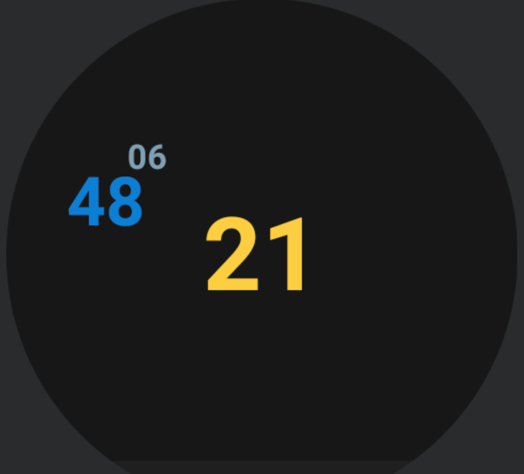
| 21:30 |
This is the first face I made for Android Wear. The bits are all individual text objects, with their values set according to that method I keep banging on about. For example, the twos minute bit is a text object with value
Text: $(#Dm#%4)<2?0:1$
The face shown above is 24hour format, where the leftmost hours digit is a dummy bit. An alternative might be to do 12hour format, with an am/pm bit.
Aside - I had this idea for a face where the background is an image of a circuit board with two rows of those little square LEDs, which could be 'illuminated' to represent the time in binary. But I'm not much of an artist, so I doubt I could create a decent background image.
Trinary [WM]
 |
| 21:35 |
In trinary, or base 3, each bit (trit?) can have one of three values - 0, 1, 2. In Zooper, I handled this by using curved progress bars, but that doesn't really work in WatchMaker. In this case, I had to use pairs of segments for each bit.
As with Zooper, I had the first of each bit pair change colour when the second was 'on', to make reading easier. Sometimes, though, WatchMaker doesn't change the segment colours like it should (possible bug?). If you prefer, you can download a version without colour changing here.
I explained how to do trinary in the previous blog. A quick reminder - the n-th digit of a number in base b is given by \(\lfloor \frac{x}{b^n} \bmod b\rfloor\).
As an example, for the pair of segments in the 3s minute bit we have
Segment 1:
% opacity in range: math.floor({dm}/3)%3 >= 1 and 100 or 15
Color: math.floor({dm}/3)%3 == 2 and '2cb7ff' or '1b74c0'

Segment 2:
% opacity in range: math.floor({dm}/3)%3 == 2 and 100 or 15
Color: 1b74c0
Notice that when we use an if-statement with the colour, we have to wrap the colour value in apostrophes (inverted commas). We don't have to do this for a lone colour value.
Similar to the binary design at the top, we have the pixelation problem on the actual watch, and again we can sort of help this by making the rings narrower.
 |
| [download] |
Clocks in other bases (as seen in the previous blog) can be constructed in a similar way.
> Planets and Parametrisations
Orbital [WM]
 |
| 10:05 |
I'm a fan of 'cryptic' clock designs - clocks that let you tell the time, but don't make it obvious. In this design, the position on the planet relative to the sun is the hours hand, and the position of the moon relative to the planet is the minutes hand.
We set the planet's position as described in the Layout section
\[ x = r_h \sin(\theta_h) \\
y = -r_h\cos(\theta_h) \]
For the moon, we work out it's position relative to the planet, then add that to the planet's position relative to the sun
\[ x = r_h \sin(\theta_h) + r_m \sin(\theta_m) \\
y = -r_h \cos(\theta_h) - r_m \cos(\theta_m) \]
The code for this is
Planet:
x: 150*math.sin(math.rad({drh}))
y: -150*math.cos(math.rad({drh}))

Moon:
x: 150*math.sin(math.rad({drh})) + 50*math.sin(math.rad({drm}))
y: -150*math.cos(math.rad({drh})) - 50*math.cos(math.rad({drm}))
Orbital Numbers [WM]
This is basically the same principle as the above, except we've replaced the sun with the hours, the planet with the minutes, and the moon with the seconds. The code is similar to above, except we replace {drh} with {drm} and replace {drm} with {drs}. We also need to make the orbital radii slightly bigger to avoid overlapping - 165 for the planet/minutes, and 55 for the moon/seconds.
Elliptical Orbit [WM]
Here the planet does an elliptical orbit once per minute. The orbit also precesses (rotates) over the course of an hour, so that the planet's aphelion (furthest point from the sun) points to the current minutes past the hour.
An elliptical orbit, with aphelion pointing to 12 o'clock is given by
\[ x = -r_x\sin(\theta) \\
y = y_0 + r_y\cos(\theta) \]
To make the orbit precess, we can use the 2D rotation matrix
\[\begin{pmatrix}
\cos\phi & -\sin\phi \\
\sin\phi & \cos\phi
\end{pmatrix}\]
which gives use the rotated coordinates
\[ x' = x\cos\phi - y\sin\phi\\
y' = x\sin\phi + y\cos\phi \]
where \(\phi\) is the angle of rotation - in this case the minutes past the hour. So for the code, the precessing orbit is given by
x: -75*math.sin(math.rad({drs}))*math.cos(math.rad({drm})) - (150*math.cos(math.rad({drs}))-80)*math.sin(math.rad({drm}))
y: -75*math.sin(math.rad({drs}))*math.sin(math.rad({drm})) + (150*math.cos(math.rad({drs}))-80)*math.cos(math.rad({drm}))
The downside to this design is that it's pretty hard to tell where the aphelion is (i.e. the minutes past the hour) without watching the orbit for several seconds. Also, in it's current state, there's no way of telling the hour. Admittedly, this isn't great, design-wise. Really I just wanted to show off the rotation matrix.
As a variation, we could have, for example, three elliptical orbits (one for each hand), to make a face modeled after the classic portrayal of an atom (nucleus in the centre, with electrons whizzing around).
Binary Orbit [Facer] [WM]
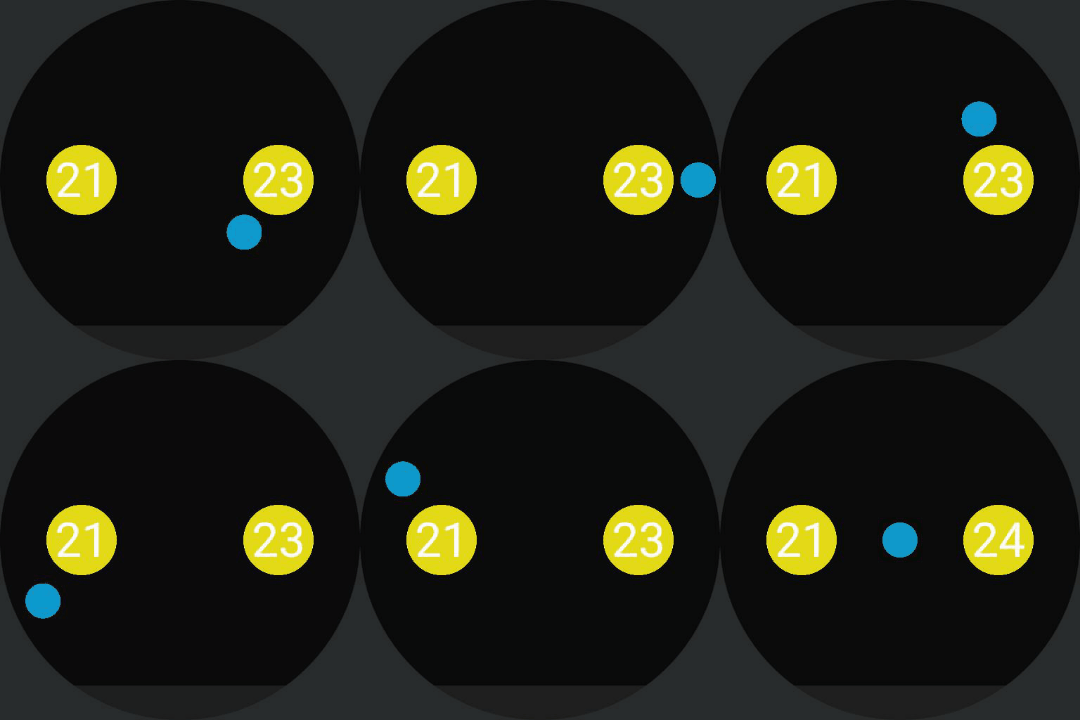
This design was inspired by another previous blog post. Here we have a planet doing a figure-8 orbit around a pair of stars.
To set the planet's position, the sideways figure-8 path can be parametrised as
\[ x = r_x\sin\left(t\right) \\
y = r_y\sin\left(2t\right)\]
or in code
WM:
x: 225*math.sin(math.rad(6*{ds}))
y: 100*math.sin(math.rad(12*{ds}))

Facer:
x: (155+140*sin(rad(6*#Ds#)))
y: (150-70*sin(rad(12*#Ds#)))
Changing the signs in front of either or both of the sin-functions will change the direction of orbit.
I was tempted to also have the stars (co)rotate - using the rotation matrix above to rotate the planet's orbit - so that they could act like an hours/minutes hand. But that seemed too much like hard work.
Spiral [WM]
 |
| 9:35pm |
In this design, the ball starts at the centre, and spirals outwards towards midday, then spirals back to the centre towards midnight. The ball's angular position gives the minutes past the hour.
The spiral is parameterised as
\[ x = r(t) \sin(\theta) \\
y = - r(t) \cos(\theta) \]
where the radius r is now a function of time. In code, this is
x: 17 + 420*({dtp}<0.5 and {dtp} or 1-{dtp}))*math.sin(math.rad({drm}))
y: -17 - 420*({dtp}<0.5 and {dtp} or 1-{dtp}))*math.cos(math.rad({drm}))
where {dtp} is the fraction of the day that has passed. Notice that we can use a conditional as a variable. That's pretty handy.
Originally, I didn't bother with the numbers (another cryptic design), but figured I should make it a little more readable. The numbers change at midday/midnight. Coding this is just a matter of creating text objects with values like
Text: {dh23}<12 and 11 or 1And so on.
Heart [WM]
Yes, I know, it looks ridiculous. When I realised I could have objects trace out any shape that can be parameterised, my first thought was the heart curve.
This has the equations
\[ \begin{align*}x &= 16\sin(t)^3 \\
y &= 13\cos(t) - 5\cos(2t) - 2\cos(3t) - \cos(4t)\end{align*} \]
and can be coded as
x: 192*(math.sin(math.rad(6*{ds})))^3
y: -156*math.cos(math.rad(6*{ds}) + 60*math.cos(math.rad(12*{ds}) + 24*math.cos(math.rad(18*{ds}) + math.cos(math.rad(36*{ds})
In the screenshot/gif, the heart graphic is just decoration. The ball doesn't trace out that exact shape, but it's close.
I added a (poorly drawn) arrow as an hour hand. The shaft is a rectangle rotated using {drh24}. The triangles that make up the arrow head and fletching are moved around using the usual sin and -cos, and have to be rotated with {drh24} to make sure they point in the right direction.
> Analogue-esque
Metric [WM]
Quick reminder - Metric, or 'decimalised' time redefines the day as being 10 metric hours long, with 100 metric minutes to the metric hour, and 100 metric seconds to the metric minute.
Aside - this means a metric minute is equal to 1 milliday, and a metric second is 10 microdays.
For the hours hand, we just set its rotation to '#DWFH#' (Facer) or '{drh24}' (WatchMaker) - even though the day is being defined as 10 hours long, the hours hand still only needs to do one revolution per day.
For the minutes hand, we have to do the full conversion, as described previously, then convert that to a rotation (in degrees). The code looks like this
WM: 360*((0.00011574*(3600*{dh23}+60*{dm}+{ds}))%1)

Facer: (360*((0.00011574*(3600*#DH#+60*#Dm#+#Ds#))%1))
Note that in Facer the whole expression has to be wrapped in brackets to be interpreted and evaluated as maths.
The seconds hand is a little trickier. If we do the conversion as before,
WM: 360*((0.011574*(3600*{dh23}+60*{dm}+{ds}))%1)

Facer: (360*((0.011574*(3600*#DH#+60*#Dm#+#Ds#))%1))
the hand will point to the right time, but because it will only update every standard (non-metric) second, it will only 'tick' about 87 times per revolution (instead on 100 times).
There is a crafty work around, though. First, we have to include milliseconds (WatchMaker) or 'smooth rotation for seconds' (Facer) in the conversion, so that the hand will update more frequently. We then use the 'floor' function to round down to the nearest whole number - this will make the hand only 'tick' once per metric second. The code looks like this
WM: 3.6*math.floor((1.1574*(3600*{dh23}+60*{dm}+{ds}+{dss}/1000))%100)

Facer: (3.6*floor((1.1574*(3600*#DH#+60*#Dm#+#DWFSS#/6))%100))
Alternatively, we could omit the 'floor' function, and have a smooth seconds hand.
Backwards [WM]
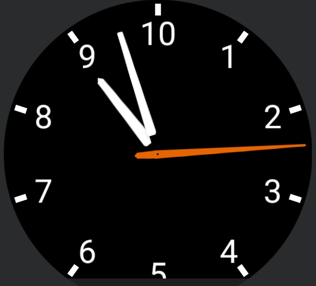
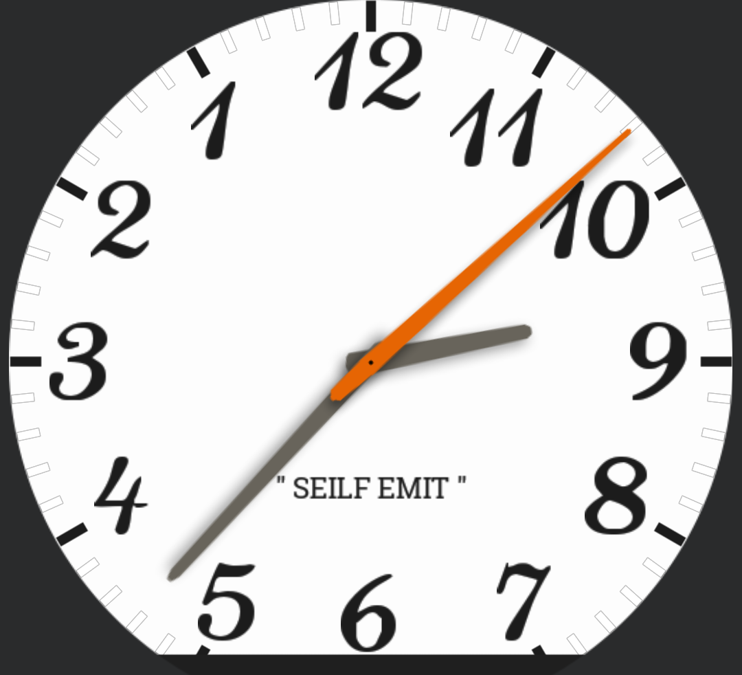
Here, I've tried to make the face design as close to the one on my bedroom wall as possible. Code-wise, this is just a matter of setting the hands' rotations to
WM: 360-{drh}, 360-{drm}, 360-{drs}

Facer: (360-#DWFKS#), (360-#DWFMS#), (360-#DWFS#)
Squares [WM]
This was just a random idea I had, and is another good example of a cryptic clock. Each square represents a hand, and they're scaled by \(\sqrt{2}\) so that they always stay within each other. The code is basically the same as for any other analogue design - set the square rotations to '{drh}-45' / '(#DWFKS#-45)', etc.
Probably I should have added indicators to show which corner of each square is the 'hand'. But I reckon you could figure out the time (or at least guess) without. I mean, the above is obviously showing 9:29:55.
Spotlight [WM]
This is not my design - I couldn't find the original source. You can actually download a version of this face from the PlayStore. This is more for anyone who's curious about how to (re)create it. Plus, this way you can customise it to your heart's content, as you'll see further down.
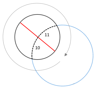
The basic idea is to create a dial that is bigger than the watch face itself, and place the centre of the dial somewhere off-screen. We then move the dial in a clockwise circle around the outside of the face, as
x: -350*math.sin(math.rad({drh}))
y: 350*math.cos(math.rad({drh}))
The hour line is just a rectangle with rotation {drh}
Spotlight with Minutes [WM]
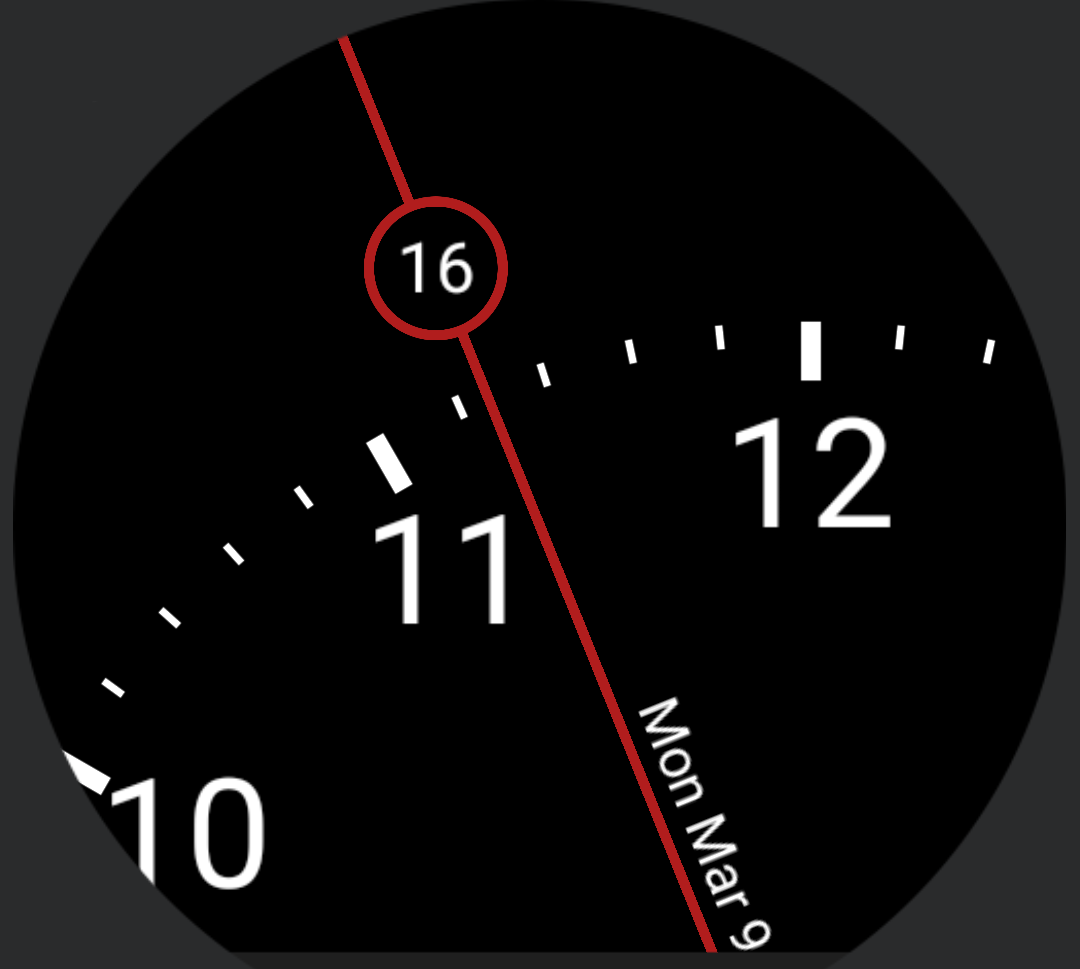
One of the problems with the previous design is that there are only five minor markers between each hour marker - so in this context they're equivalent to 12 minutes each. This makes telling the minutes past the hour tricky. To remedy this we can introduce a little minutes circle.
This is just a matter of creating a circle outline and a minutes object, and moving them around as
x: 135*math.sin(math.rad({drh}))
y: -135*math.cos(math.rad({drh}))
Alternatively, we could use a dial that has a more useful number of minor markers. But the minutes circle is more visually striking, I think.
Spotlight with Minutes and Date [WM]
Okay, last one of these. I figured 'centre', above the hour line was the best place to put the date. For this, we have to make sure the date stays on the right side of the line and stays the right way up.
 |
| Positions of the date relative to the hour line (left) and the corresponding positioning functions (right) |
The code to do this is
x: -165*math.sin(math.rad({drh})) + ({dh11}<6 and -20 or 20)*math.cos(math.rad({drh}))
y: 165*math.cos(math.rad({drh})) + ({dh11}<6 and -20 or 20)*math.sin(math.rad({drh}))
Rotation: {drh} + ({dh11}<6 and -90 or 90)
Where the first terms for x and y move the date around with the hour line (note the signs), and the second terms are the positioning functions (dx, dy) that shift the date to above the hour line. The conditional in the rotation makes sure the text stays the right way up.
There is a slight problem with this on the Moto 360 - as you might notice in the above, the date will dip below the 'flat tire' line between about 11:15 and 12:45. If you have a 360, you might want move the date further along the line (change '165' in the code to something smaller).
> Fun with Progress Rings
Circles 1 [WM]
 |
| 2:27am (left) and 9:28pm (right) |
The outer ring segment represents the hours, and fills in (clockwise) towards midday, then 'unfills' from midday to midnight. This is made with a 'Segment Between' shader (WatchMaker Premium only) with
Degree Start: {dh23} < 12 and 0 or {drh0}
Degree End: {dh23} < 12 and {drh0} or 360
The orange circles around the outside are hour markers, and also give the hour ring the appearance of rounded corners. In this design, the smaller white circles over the hour markers act as minute markers, which change colour with the passing minutes, as for example
Colour: {dm}>=5 and 'ffbd2a' or 'fbfbfb'for the 5 minute marker, and so on.
Circles 2 [WM]
 |
| 9:34pm |
This design has the minutes as a separate inner ring, with four marker that behave similar to above, and with a 'progress ring' which indicates the exact minutes past the hour. The progress ring is made with another Segment shader, and the rounded corners on leading edge is done with a small circle, moved around with sin and -cos.
Circles 3 [WM]
 |
| 1:36am (left) and 8:51pm (right) |
To make this we start with Circles 1, and for the minutes ring create two Segment Between shaders, which overlap half of the hours ring, with
Segment 1:
Segment Start: 0
Segment End: {drm}<{drh0} and {drm} or {drh0}
Color: {dh23}<12 and 'fbfbfb' or 'ffbd2a'

Segment 2:
Segment Start: {drh0}
Segment End: {drm}>{drh0} and {drm} or {drh0}
Color: {dh23}<12 and 'ffbd2a' or 'fbfbfb'
We then need to create a smaller copy of the hours segment from Circles 1, as well as a segment with
Segment Start: {dh23} < 12 and {drh0} or 0
Segment End: {dh23} < 12 and 360 or {drh0}
Color: fbfbfb
to cover up the centre of the minutes segments and recreate the inner half of the hours ring.
The minute markers work as in Circles 1, but this time the hour markers also change colour, as for example,
Colour: ((({dh11}>1 and {dh23}<12) or ({dh11}<1 and {dh23}>=12)) and {dm}>=5) and 'fbfbfb' or 'ffbd2a'You might notice in the screenshots above that this design seems to have a thin grey shadow/outline around some of the ring. I don't know if this is a bug or a feature of the shaders, but ideally it shouldn't be there.
Apple Activity [WM]
I saw something that looked like this in an Apple Watch promo - I think it was supposed to be an activity tracker. Anyway, it's a watch face for Android, now (take that, Apple). Shaders for progress rings, circles over the edges for rounded corners, I'm sure you get the idea by now.
Buffering [WM]
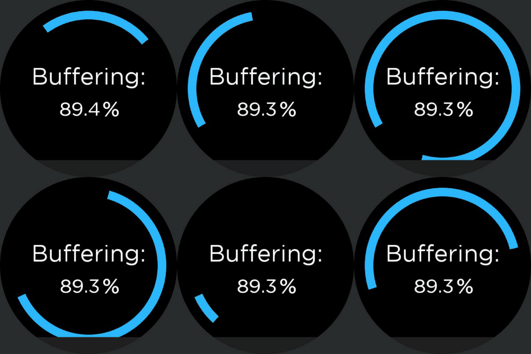
I was playing with shaders and came up with this, that looks sort of like a loading/buffering ring. The ring fills and unfills once a second, and the point where the ring fills from/to indicates the current seconds past the minute.
The code for this is
Segment Start: ({ds}%2==0) and {drs} or ({drs}+0.36*{dss})%360
Segment End: ({ds}%2==1) and {drs} or ({drs}+0.36*{dss})%360
The percentage in the image above is the percentage of the day that has passed
Text: string.format('%.1f', 100*{dtp})The format function is used to round the percentage to one decimal place (Lua uses C-style formatting). Alternatively, I guess you could have hour and minute rings doing similar to this seconds ring, but that might be a bit dizzying.
Bonus: How to Make a Battery Ring in Facer [Facer]
As we've seen, making a progress ring in WatchMaker Premium is easy with shaders. But, you can actually make something similar to a progress ring in Facer.
The easy way to do this is to use polygons (squares, triangles, hexagons) to cover up sections of a ring, with the polygons coloured the same as the face background. We can then alter the polygon opacities to hide/reveal sections of the ring.
This gives us a progress ring with discrete intervals. How granular it is will depend on how many polygons we're willing to set up. For a battery meter, we could cover up a ring with 100 little squares, but it'd be a pain in the arse to build.
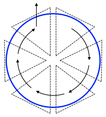
There is also a way to do a continuous progress ring, without too much effort - though it's a bit of an elaborate workaround. First we cover up a ring with 6 triangle, then we can shift, rotate and change the opacities of those triangles to hide/reveal the ring.
It works sort of like a folding fan. The first triangle moves into the position of triangle 2, then turns transparent. Triangle 2 then moves to 3 and turns transparent. And so on, until we get to triangle 6. Obviously, if we move triangle 6 around the circle like the others, it'll cover up section 1. So instead, we move it vertically upwards.
Admittedly, this makes the angle on the leading edge of the ring look a bit off in section 6. But we work with what we've got. There are various fiddly little work-arounds that we could use to correct this - e.g. we could cover the leading edge with a little circle or square. Those are left as an exercise for the reader.
The code works like this
Triangle 1:
x: (160+50*cos(rad(3.6*#BLN#))+80*sin(rad(3.6*#BLN#)))
y: (160-80*cos(rad(3.6*#BLN#))+50*sin(rad(3.6*#BLN#)))
Rotation: (30+3.6*#BLN#)
Opacity: $#BLN#<(100/6)?100:0$

Triangle 2:
x: $#BLN#<(100/6)?260:(160+50*cos(rad(3.6*#BLN#))+80*sin(rad(3.6*#BLN#)))$
y: $#BLN#<(100/6)?160:(160-80*cos(rad(3.6*#BLN#))+50*sin(rad(3.6*#BLN#)))$
Rotation: $#BLN#<(100/6)?30:(30+3.6*#BLN#)$
Opacity: $#BLN#<(200/6)?100:0$
And so on for the next 3 triangles (with the boundaries and initial positions suitably adjusted). Finally, for the last triangle, we have
x: 110
y: $#BLN#<(500/6)?80:(80 - 130*(0.06*#BLN# - 5))$
Rotation: 30
Opacity: $#BLN#<100?100:0$
Aside - constructing this made Facer run slooooooow.
So there you have it - it's not easy, but it is possible to make a progress ring in Facer. You could do the same trick in WatchMaker (free) if you didn't want to pay for Premium. But personally, I'd prefer to pay - shaders are easier, and more flexible.
> Other Assorted Nonsense
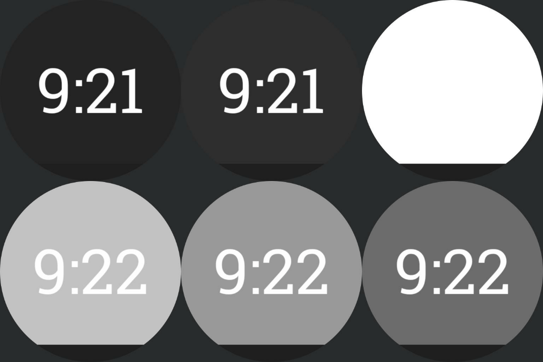
50 Shades of Grey [Facer] [WM]
This is the sort of dumb thing I think up when I can't get to sleep. To make this, we create a watchface with a white background, and add a black circle/square that fills the whole screen. We then set the circle's opacity to
WM: 2*math.floor(5*{dsps}/6000)

Facer: (2*floor(#DWFSS#/7.2))
This will cycle through 50 different shades of grey - from white to black - over the course of a minute.
Alternatively, we could have it cycle from white to black to white, so that we don't have the sudden jump from black to white at the end of a minute - [download]
For that, the code is
WM: {ds}<=30 and 4*math.floor(5*{dsps}/6000) or (198-4*math.floor(5*{dsps}/6000))Aside - Facer doesn't seem to allow mathematical expressions in both the then-statement and the else-statement (?!), so we can't adapt the above. Which is annoying.
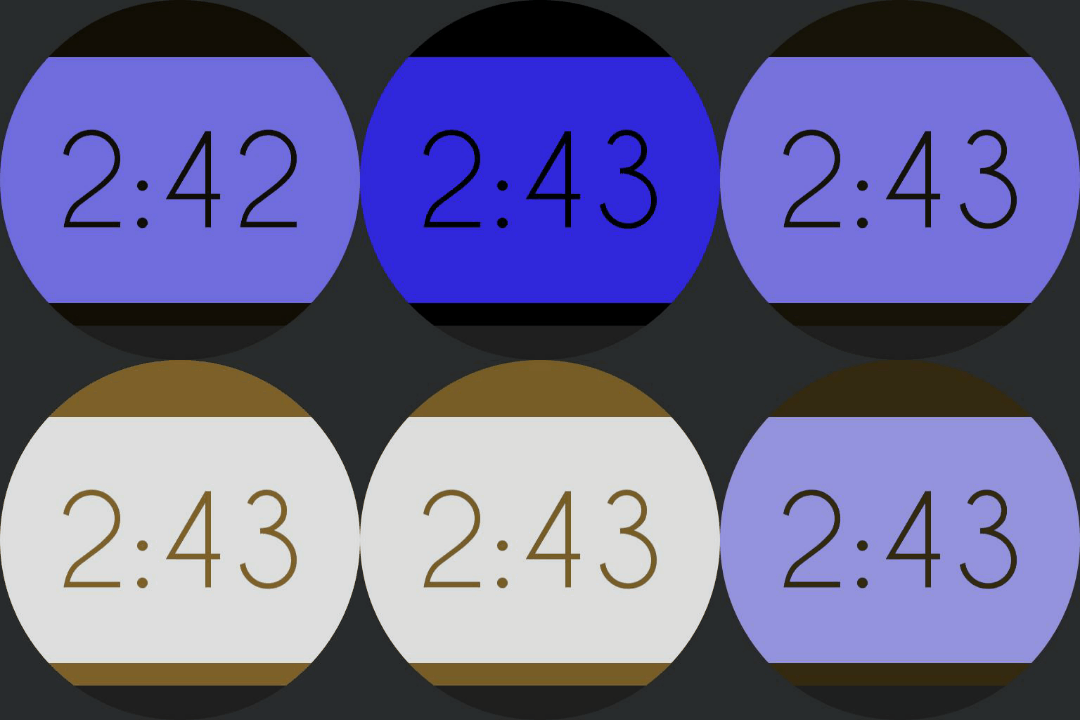
That Dress [WM]
You know the one. This works similarly to the above design - only this time we use 'HSV' shaders (WatchMaker Premium). For the background, we have a circle that fills the screen with
Colour: 3228de
Saturation: -{dsps}/600
And the text, and the bars at the top and bottom of the screen are
Colour: a07b35
Value: 8*({dsps}/6000)-80
This will go from black-blue to white-gold over the course of a minute. We can get a similar effect by layering a blue circle on top of a white background, and black text on top of a gold copy of the text, then varying the opacity of the black and blue. That method should work in Facer.
Alternatively, we can have the face cycle black-blue to white-gold to black-blue - [download]
Circle:
Saturation: {ds}<=30 and -{dsps}/300 or {dsps}/300-198

Text/bars:
Value: {ds}<=30 and {dsps}/375-80 or 78-{dsps}/375
Racing Numbers [WM]
Racing, in the sense that the numbers are moving from the right side of the screen to the left, all at different speeds (I couldn't think of a better name). Alternatively, you can think of it as the numbers being positioned horizontally based on their current value. It's straightforward enough to construct, I'm sure you can figure it out.
Jitters [Facer]
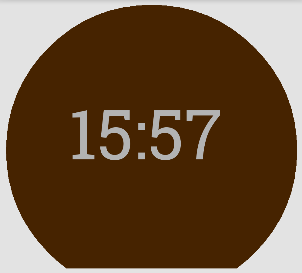
I don't have a gif of this - so imagine the time in the above image frantically jittering around the centre of the screen. The background is brown because I was tempted to call it 'too much coffee'.
This design is pretty much a case of, I saw that Facer had a 'random' function and I wanted to contrive a use for it. To make this face, we just set the position of the time object to
x: (150+rand(0,20))
y: (170+rand(0,20))
The time will be moved with every frame refresh - in Facer's case, I think that's 60fps. As far as I can tell there's no way to slow it down. I imagine this would get annoying after a while.
Conclusion
If you have a smart watch, making the face a replica of a 'dumb' watch seems a bit like missing the point. Having said that, if I saw a replica of my old watch I'd probably download it.
But the point is, you can do some design things with a smart watch that you could never do with a dumb watch. These are just a few ideas of some cool things you can do with face making apps.
Feel free to download, use, modify, re-post, etc. any of the designs or code in this post. You don't need to ask permission. If you do re-post, a name-check or link back would be nice, but I won't hold you to it.
The folder with all the faces is available here.
If you have any problems, want more details, or just want help with something, feel free to ask in the comments and I'll see what I can do.
Oatzy.
[If I had any sense I'd be trying to make some money off these...]

