Some Twitter Infographics
25 Mar 2012 I did some stuff like this before. And I figured, while I was updating my network graphs, why not update some of the other graphics?And it helps that I worked out how to easily extract data from Twitter (see previous blog). The code is here. Again, rate limits apply.
Who Do I Follow?
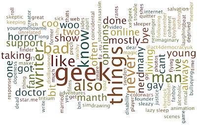
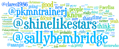
This is one of the ones I did before - collect together the bios of the people I follow, then make a word cloud (using Wordle)
Basically, I follow a bunch of geeks and writers. Who like 'things'. So really, same as a year and a half ago.
I would point out though that 6 of the people I follow don't have bios, and about 7 just have lyrics.
Data here.
Who Tweets the Most?
These rates are worked out as (total tweets posted)/(total days online). Obviously, the actually post rate will vary over different time scales..
Bubble chart (made with ManyEyes) - bubbles sized by tweet rate (the numbers on some of the bubbles).
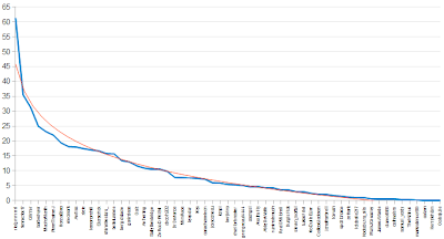
The graph below gives a better idea of relative rates, and 'rankings' (click to embiggen)
The blue line is actual values.
The orange is a logarithmic trend-line. It's a pretty good fit (R2=0.95); and, loosely speaking, it means ~70% of the tweets in my timeline come from ~30% of the people I follow. [cf: Pareto Principle]
You get similar log-shaped graphs when you split up the genders.
Full data here.
Chattiest Gender?
You can read all the explanation, caveats, etc. in the previous posts (here and here). I'm just going to go straight into the data.
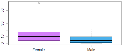
I follow 27 men and 21 women (excluding celebrities, etc.). The stats are as follow:
Men:For clarity, here's a boxplot (made in R)
Average = 6.21 tweets/day
Standard Deviation = 6.47
Women:
Average = 13.79 tweets/day
Standard Deviation = 14.27
Basically, the women tweet more on average, and their rates are more spread out than for the men. In fact, roughly three quarters of the men tweet less than half of the women. Also, there's one outlier in the female group.
This is similar to what we found last time; although the women's average and spread aren't quite as high (average: 13.79 vs 19.21), and the men's average has increased slightly (6.21 vs 5.29).
If you take the ratio of the averages, the women tweet 2.15 times as much as the men. But maybe I just follow particularly chatty women..
Here's treemap (ManyEyes), which should give you a better idea of the gender balance (boxes sized by tweet rate)
Specifically, the graphic above is 62.5% purple (female).
Data here.
Where in the World Are My Followers?
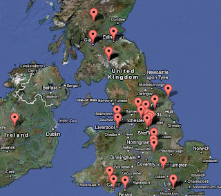
The site I used last time doesn't seem to exist anymore. So I'm using MapMyFollowers instead. As the name suggests, these are my followers, rather than just the people I follow. Nonetheless..
Mostly in the UK and the US. As you'd probably expect.
I will point out though, some of the locations are a little suspect. Some people haven't made their location available so aren't included, and others seem to be in countries they couldn't possibly be in. But it's the best we can do.
Here's a zoom in on the UK
What Do I Tweet?
Made with Wordle, with data from TweetStats.
Words are sized by how often I tweet them; and by extension, @usernames are sized by how often I tweet those people.
In fact, here are the people I 'mention' the most (TweetStats)
Couldn't get a good source on who @replies me. That was one of the things Twoolr used to do..
When Do I Tweet?
Twoolr used to be awesome for Twitter statistics. But sadly, when they left beta, they started charging. And their free service went to shit. Luckily, I found TweetStats. Weirdly, it doesn't need you to log-in or anything, but somehow it can pull data on (nearly) all your tweets - beyond the 3,200 limit. Strange.
Here's some more graphs
Basically, I tweet most on a Friday and Saturday, and at around 1-2pm.
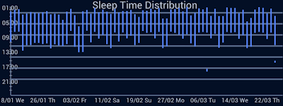
And I've never tweeted at 5am. But that's probably because I'm always asleep at 5am
Except that one time I got really drunk. (SleepBot)
How Much Do I Tweet?
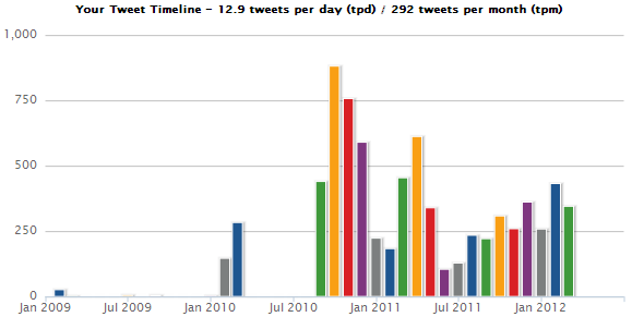
This is another one I used to go to Twoolr for. And, to be fair, I still could. But that only goes as far back as April '10, and its graphics aren't as clear. Here's TweetStats again
Like I said before, I didn't tweet much in my first year. In fact, I only posted 36 tweets in all of 2009.
Now, the one problem with TweetStats is that 5 month gap in 2010. Why is this significant? Well, I was definitely tweeting during that time. In fact, by my estimates, over those 5 months I posted 5,724 tweets (~37tweets/day). So those 5 months account for 43% of all my tweets.
See, the thing is, in 2010, I was out of university, single, and unemployed. I posted a total 8,823 tweets - 24tweets/day. Since I've been back at university, that number's dropped to 11tweets/day.
That lull in Summer 2011 was when I was spending all my time on Tumblr and watching classic Doctor Who. Incidentally, I haven't posted on Tumblr since the start of September '11. It's terribly addictive, you see. I wouldn't recommend it; unless you're addicted to Doctor Who and Sherlock, and have lots of time on your hands..
So yeah.
Oatzy.
[Self-indulgent statistics, and pretty illustrations.]
