Friend Network Evolution
15 Mar 2012 Back in February 2009, I created my Twitter account, upon the insistence of my then-girlfriend. I didn't get it. Back then, Facebook was where it was at, I didn't really get Twitter's appeal. I was pretty much just following the handful of people I knew in real life, and Stephen Fry.So I didn't use it much. I'd pop up every now and then, post a couple tweets and give up on it again. At one point, I even developed an irrational dislike of it - whenever I saw a site had a "follow us on Twitter" button, it irked me for some reason.
But at some point, towards the end of 2009/early 2010, I gave it yet another try. I don't know why. And even when I started using it, I was resistant; still half-heartedly hating it. But what was different this time, is I started chatting with people, and I was introduced to new people.
People who don't get Twitter think it's just that thing where you can tell people when you're eating a sandwich. It's not. It's the people that make Twitter. (Tweens and arseholes notwithstanding.)
But I'm going off on a tangent.
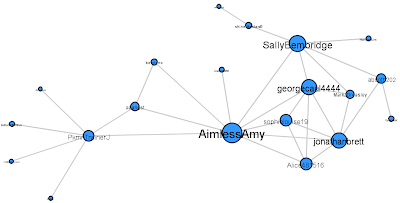
By August 2010, I was well into Twitter - I was posting around 30 tweets per day, and I had around 30 friends*. And back then, I decided I wanted to see what my friends network looked like. So I broke out Python and the Twitter API, I pulled data, and I made the graph. Here's an updated version of it.
[click to embiggen]
Fairly small, and tidy, and relatively uncomplicated. The bulk on the right is the people I knew in real life (from school, etc.) with a few strands of new acquaintances. Note how tightly packed and interconnected they are. To the left is mostly people I met through Twitter - and in particular, through PkmnTrainerJ.
(In case you hadn't figured it out, the node and label sizes are proportional to number of connections.)
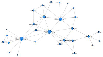
By December 2010, I decided to have a look again.
Again, this is an update of the version I originally posted; and in this case, I've tried to arrange it so that key people stay in approximately the same place.
So you still vaguely have that left-right divide, but now there's much more mixing in the middle. I'd made some new friends, but more interesting is the people who were already in the graph who formed new connections with others in my graph.
I'd also like to draw your attention to shinelikestars_ (formerly shinelikestars6) - take a look at the previous graph, can you spot him? From 2 shared connections to 8 in the space of two months. I don't think there's any sort of point I'm trying to make here. I'm just pointing it out 'cause it's interesting.
And for the next year and a half I didn't do any data collecting. It became too labourious - Twitter changed its API, so that my old code didn't work, and I had to do everything by hand.
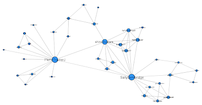
So, the latest graph was March 2011 (technical details below). As you can imagine, a lot can happen in a year and a half.
First of all, the new people add, and the old people removed. But more importantly, look how much tighter, and how much more 'segmented' the graph is.
There are now three major groups, loosely centred on the three most connected of my friends.
On the far right are, again, the people I knew in real life. In particular, note how little that group has changed since the first graph.
In the middle, we have 'Shiney's People' - people I was introduced to by shinelikestars_. And on the left are the people I was introduced to by PkmnTrainerJ.
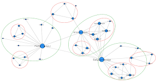
The smaller groups circled in red are cliques - smaller subgroups that, at least from my point of view, form their own little groupings, where (almost) everyone is interconnected. The bottom left 'clique', for example, is my parents and big sister.
And I suspect, if you were to extend the graph beyond my network, you would find that those cliques are just parts of larger interconnected groups.
In case you were wondering, PkmnTrainerJ and SallyBembridge are most connected, both with degree 14. shinelikestars_ is next most, with degree 10.
Notable disappearing nodes - Benjidoom, who deleted his account, then created a new, private one (benjirino); and AimlessAmy, who is a long story.
I should also point out that the people I follow who aren't friends with anyone else in my network do not appear in the pictured graphs. Not that they aren't as cool, they just don't join onto the graph.
* I use friend here to mean people who I follow and who follow me back. Though I would probably consider all the people in my current network (including those not pictured) friends to some degree.
Technical stuff
You can read details on how I collected the data before, in the previous blogs. But, as I say, those methods don't work anymore.
For this run, I read up on the API, and found some bits that don't need authentication to grab and manipulate.
First, you can grab a list of a user's friends with this URL
https://api.twitter.com/1/friends/ids.xml?screen_name=<username>
This will give you a list of the friends ID numbers, so you also need to use this to grab usernames
https://api.twitter.com/1/users/lookup.xml?user_id=<idnumber>
There is also a URL to check if a user follows another user
https://api.twitter.com/1/friendships/exists.xml?user_id_a=<idnumber1>&user_id_b=<idnumber2>
Which works through the browser, but I couldn't get to work in my code. So in place, I used the site DoesFollow.com; partly because it uses the URL scheme
DoesFollow.com/user1/user2.
Which is very convenient. Though I do worry all the requests might be putting strain on that site's server.
So, putting all that together with a bit of Python, you get something like this.
A few important points:
1) It will take a while to run. I have ~50 friends, and it took well over an hour to pull all the data. In terms of computational complexity, it's O(n^2), but each of those operations takes a significant amount of time.
2) Twitter has an API limit of 150 requests per hour. The number of API requests the code will make is ~ the number of friends being looked up. I think. Which means, if you have more than 100 or so friends, this code probably won't work. Sorry. There might be a way around it, but I don't know how.
3) Obviously, this doesn't work on protected accounts. So for those people you will have to grab data by hand. Though it's not too bad for a small enough number of people.
If you do want to use the code, I've made it so you just have to change the username at the top, and run it. You will need to install Python though.
For creating the graphs, I previously use ManyEyes. But I moved to using Gephi, because it allows for more customising. The output from the code is a text file with a list of name pairs, which you can import directly into Gephi. It will build the graph for you, and then you're free to play as you like.
Aaand... Yeah, I think that's about it.
Oatzy.
[shinelikestars6 lost his red circle, on account of he isn't my nemesis anymore.]


