Follow Up: More Graphics
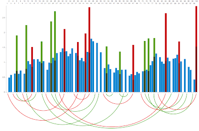
29 Jan 2011 I'm sticking these in a new post, rather than updating the last post (and potentially, nobody seeing them).First of all, as I said yesterday, the 'entrance' squares of the snakes and ladders don't technically exist; in so much as, as soon as you land on them you move to the coresponding exit. So I updated the network graph to reflect this
But this version isn't quite as aesthetically pleasing as the other one. Still, at least no-one can accuse me of not doing it right.
And as you'd probably expect, the number of curves directed into a given square's node in the above graph is loosely related to the probability of visiting that square
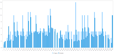
And the other thing is, I wasn't happy with the board histogram - the bar chart of how often you land on each square. So I played with it a bit, to try and find the clearest, prettiest, and most easy to interpret representation of the data.
This is what I came up with
The numbers for entrances and exits are stacked, so you can see how often a given exit square is visited in total, and what proportion of those visits are from moving along a snake or ladder.
For example, there's about a 47% chance of getting to the end via the 80-100 ladder.
The arcs show which squares are linked.
Oatzy.


