Model Trains
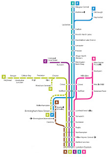
31 Dec 2010 Continuing from the previous post on using PageRank to rank stations by 'popularity', and with the help of Gephi - which makes it ridiculously easy to built network graphs and work PageRank out - I built the Virgin Pendolino lines, and they look like thisI then worked out PageRanks and picked a route I'm failiar with - the one that goes between Coventry and Birmingham New Street (the brown line).
Old Model
Going back to the equation I outlined in the first train post, the number of passenger on the train at station i is modelled by
So now, we define
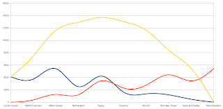
Where P(i) is the PageRank of station i, and a is some constant. We then work out 'passenger' numbers for each stop and get the graph below
Here the blue line is number of people boarding, the orange line is people getting off and the yellow is total on board.
And the interesting thing here is that while the on/off lines are quite squiggly, they seem to cancel each other out quite well leaving a fairly smooth curve for total passengers. Which you would kind of expect, since a popular station would have more people getting on AND getting off.
So the question then was, how significant is the wiggliness that's left in the yellow curve.
A Simpler Model
For this, we imagine a train with the same number of stops (10) as above, but where T(i,j)=1 for all stations i,j - i.e. there's only one person going between each pair of stops. And the nice thing about this is that the above monstrocity of an equation reduces to
where i is the current station's position on the route and n is the total number of stops.
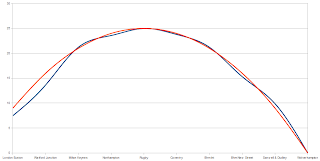
And if you multiply that by some constant to get a best fit and plot them together, you get this (orange is the fit)
Which is a pretty damn good fit. Except for the first two stops. And what's weird about it is, you'd expect that the fact that there aren't any people getting off to cancel out the attenuation would mean the ideal curve would under-estimate. But it over estimates. I'm not sure how to explain it. But other than that..
Decent Approximation
And what the close fit suggests is that the 'popularity' of the station isn't as important a factor as how far along the route it is. Which, if true, simplifies the problem a massive amount.
But that first station is still a problem, because that's an error or ~20%. And considering <5% is usually considered the acceptable error limit, it's looking kind of bad.
But you could argue that since it doesn't have a knock-on effect for the later stops, and because the passengers on-board after the first stop is countable on the platform, it's an acceptable 'problem'.
Realistically, I should try the same for other routes to see if the same happens, or else find some real data to test it against. Because it could turn out I'm catastrophically wrong. Or I could turn out to be right. But for now, I'm content.
Other Factors
And that's that. So the only other thing that would affect passenger numbers on a per-station basis is rush-hour effects. This is significant over longer routes mainly, but it's significant bacause it affects the passengers getting on at a particular station differently to how it affects those getting off - this creates a disparity that doesn't cancel itself out like the above.
But at the same time, thanks to the Department of Transport, we do have numbers to work from for that. Then we just need to put together that model and multiply by some number - which can be found by counting, say, the number of people on the platform - and we hopefully have a pretty got estimation of whether or not you'll get a seat.
And I'll finally be able to let go of this madeness. Fingers crossed!
Oatzy.


